Help Tutorial


EvoNiche is a comprehensive database developed to enable comprehensive analysis of spatial patterns and heterogeneity, spatiotemporal evolutionary trajectories, and spatial cell-cell interactions, integrating multi-dimensional spatial omics data with advanced analytical frameworks for delineating the dynamic architecture of tumor ecosystems.
The home page contains tool entrance, schematic diagram and brief introduction to help users understand our database.
1.Main functions of the database are provided in menu bar form.
2.The brief introduction and statistics information of EvoNiche.
3.Overview of the images that Regional Dynamics Module and Spatiotemporal Dynamics Module.
4.All of TMEvolution’s powerful analysis tools.
The browse page contains the basic information of the spatial transcriptome dataset and the single-cell dataset.
1.Browser page provides statistics information about spatial transcriptome dataset and single-cell dataset.
2.Showing the number of slices and spots contained in the spatial transcriptome dataset for each type of cancer.
3.Showing the number of cells contained in the single-cell dataset of each type of cancer.
4.The detailed information of each spatial transcriptome dataset is presented in tabular form. Users can filter the datasets of interest according to cancer, tissue and technology in the Tree View on the left. Users can also enter relevant information in the search box at the top of the list to filter the displayed datasets. Users can jump to the relevant tool page of the dataset by clicking on the icon of the relevant basis in the Tool bar.
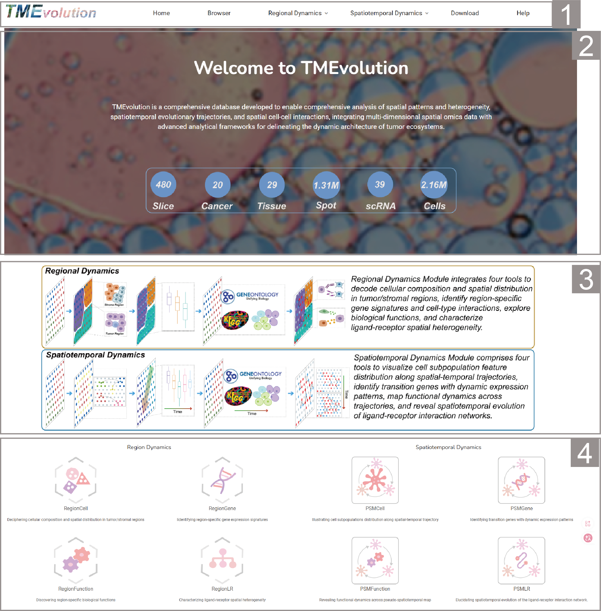
Regional Dynamics Module consisting of four tools.
RegionCell
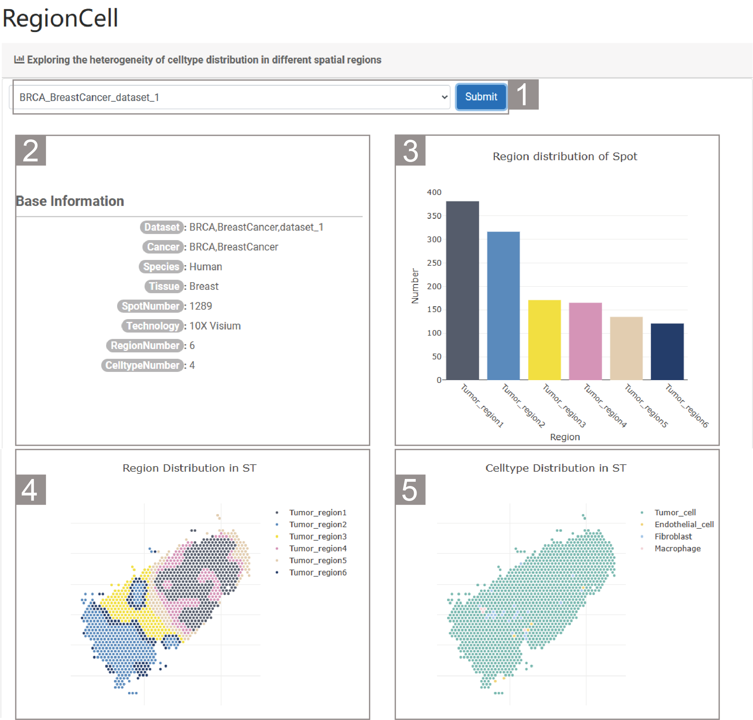
1)Exploring the heterogeneity of celltype distribution in different spatial regions
1.The user needs to select a dataset and click “Submit”. By default, the analysis result of the dataset “BRCA_BreastCancer_dataset_1” is given.
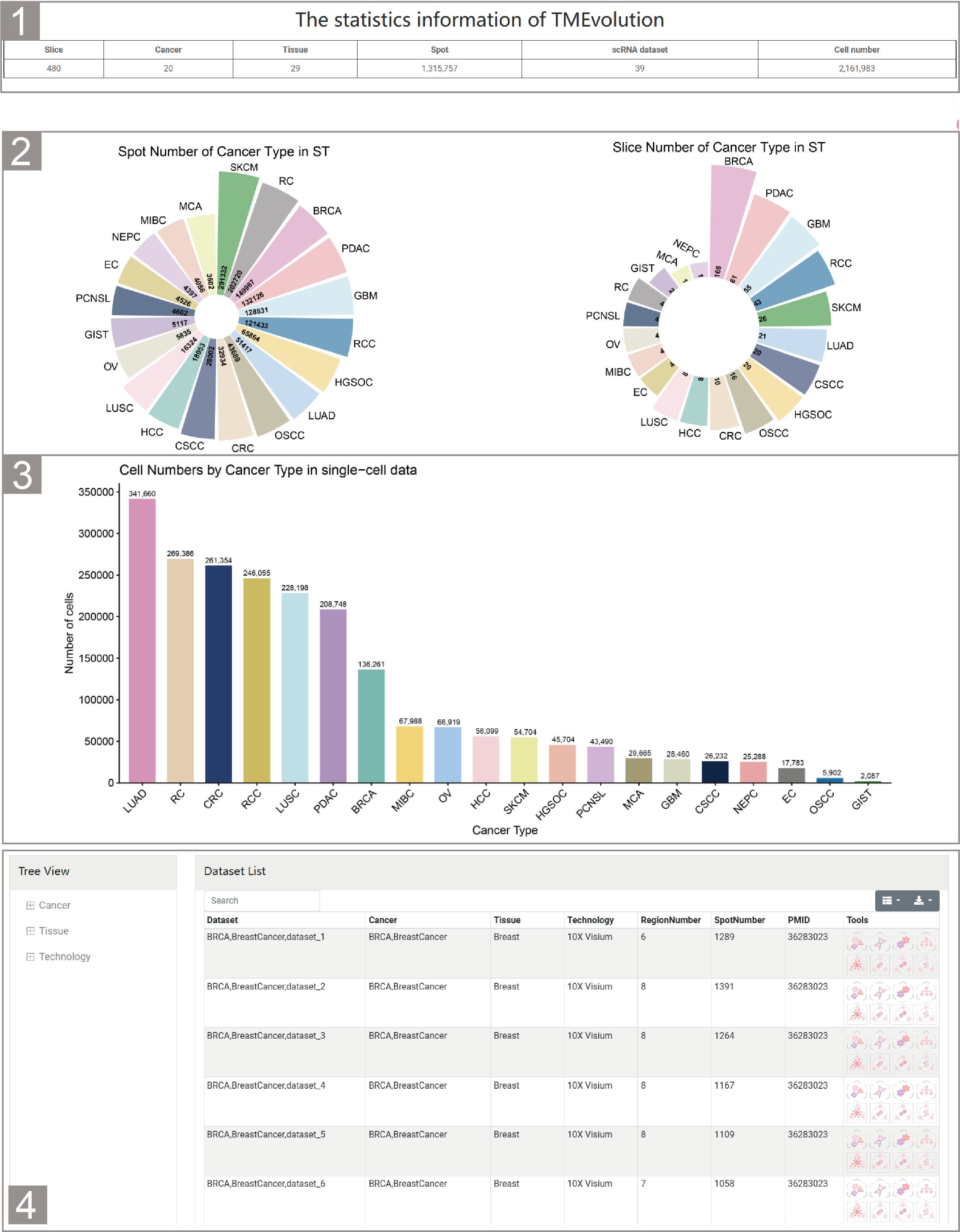
2.This table provides the basic information of the dataset. The specific information includes the dataset name, cancer type, species, number of spots, number of genes, number of spatial regions and number of cell types.
3.The histogram shows the number of spots in each spatial region.
4.The spatial transcriptome slice shows the division and distribution of the spatial regions.
5.The spatial transcriptome slice shows the cell types and their distribution.
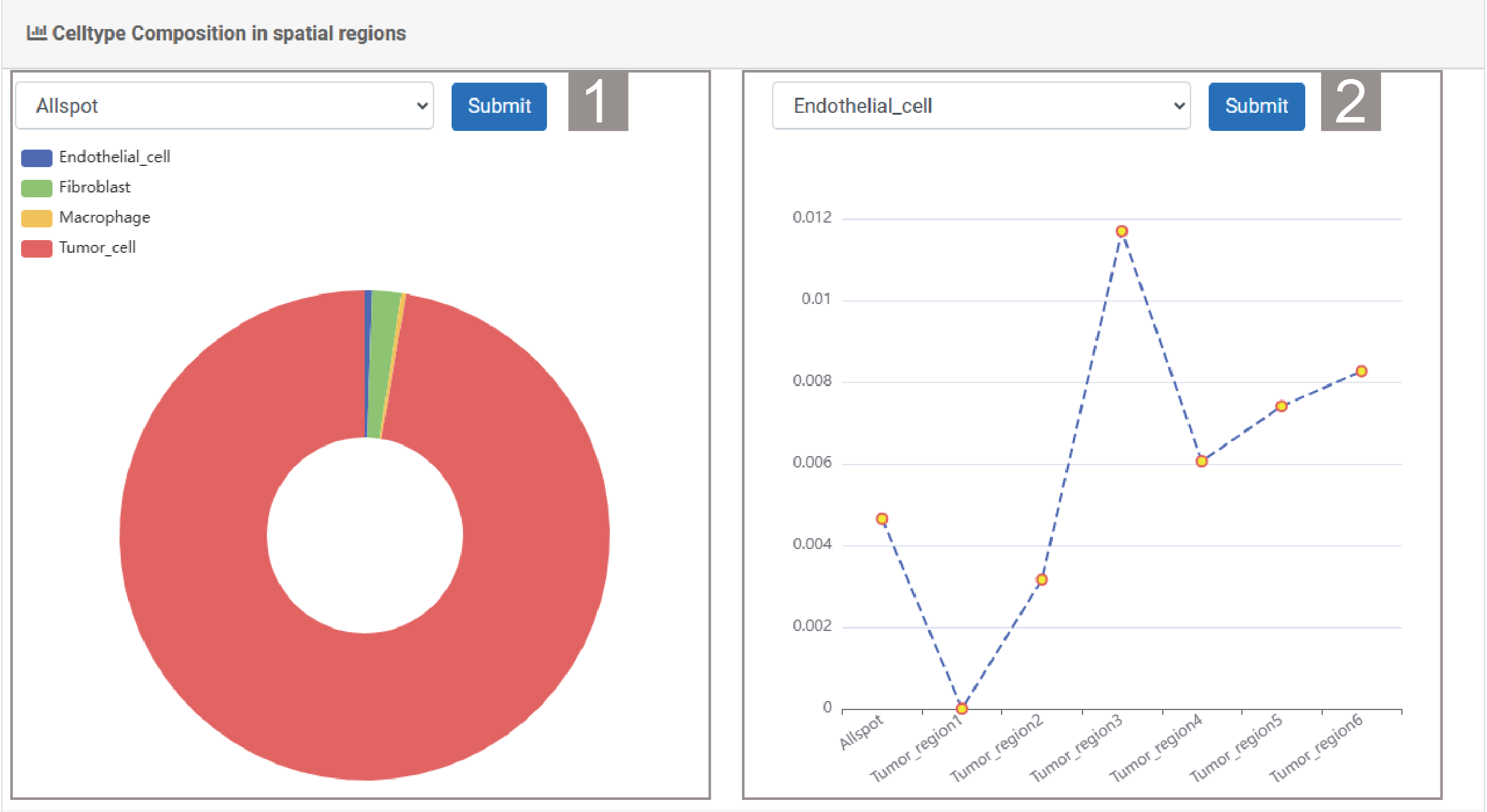
2)Celltype Composition in spatial regions
1.The user can select a spatial region and click “Submit”. By default, the analysis result of all spot is given. The pie chart shows the proportion of different cell types in the spatial region.
2.The user can select a celltype and click “Submit”. The line graph shows the proportion of this cell type in different spatial regions.
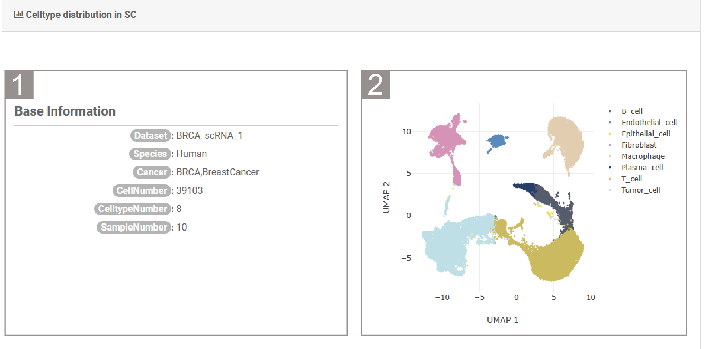
3)Celltype distribution in SC
1.The list shows the basic information of the single-cell dataset, including the dataset name, species, cancer type, number of cells, number of cell types and sample number.
2.It shows the UMAP map of the single-cell dataset based on cell types.
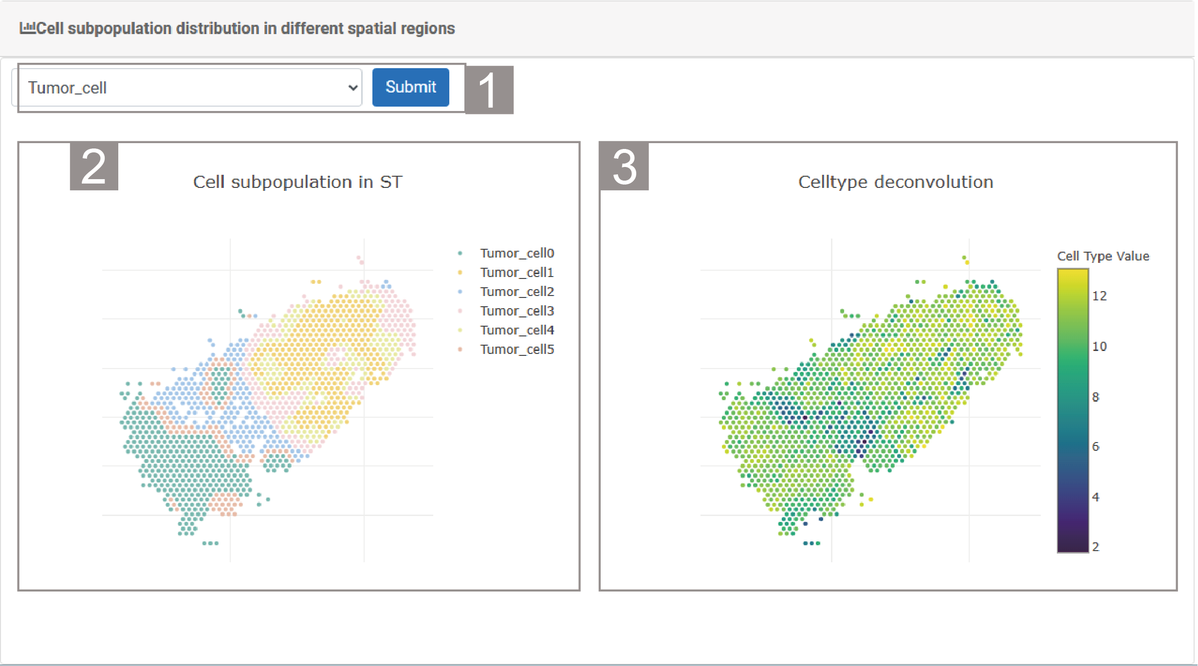
4)Cell subpopulation distribution in different spatial regions
1.The user needs to select a celltype and click “Submit”.
2.The spatial transcriptome section shows the subtypes of this cell type and their distribution.
3.The spatial transcriptome section shows the deconvolution scores of each spot regarding the cell type.
RegionGene
RegionGene provides the heterogeneity of gene expression distribution in different regions and its interaction with cell types.
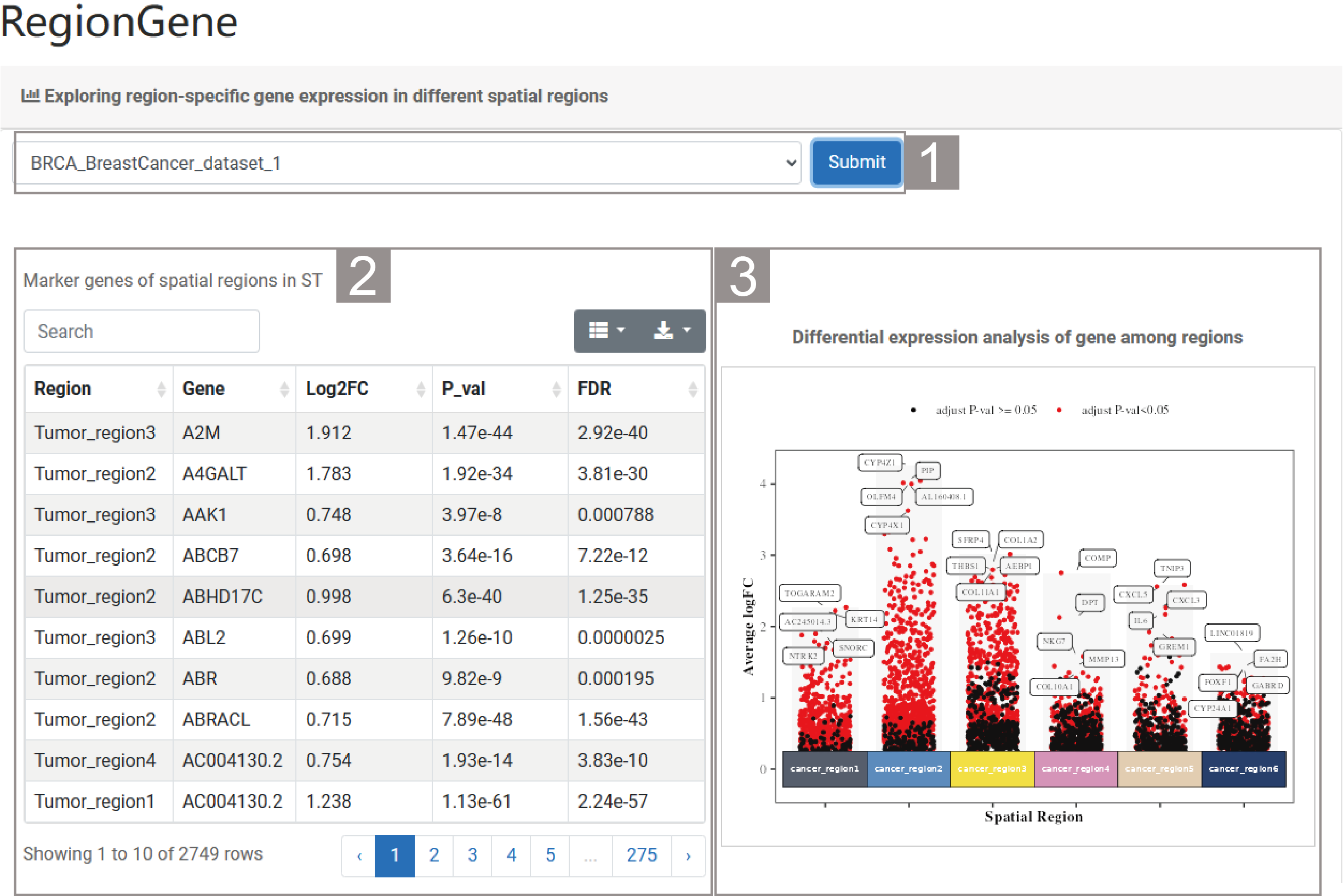
1)Exploring region-specific gene expression in different spatial regions
1.The user needs to select a dataset and click “Submit”. By default, the analysis result of the dataset “BRCA_BreastCancer_dataset_1” is given.
2.The list presents the marker gene and their related information between different spatial regions, successively showing the spatial region, gene name, Log2FC value, P value and FDR value. Users can search for the spatial regions or marker genes of interest through the search box above the list.
3.The scatter plot presents the results of the analysis of gene differential expression between spatial regions. The names of the top five genes are marked in the figure.
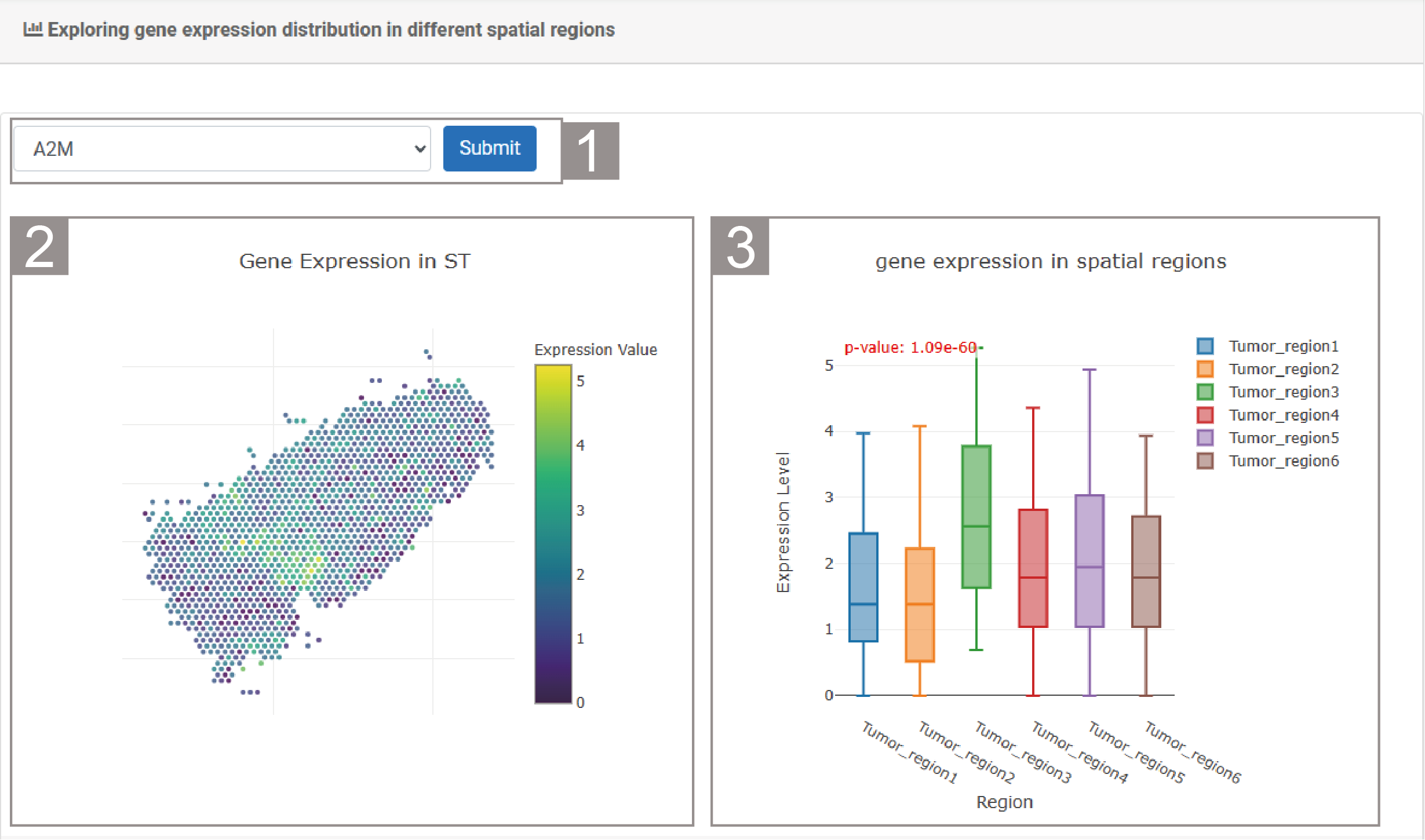
2)Exploring gene expression distribution in different spatial regions
1.The user can select a gene and click “Submit”.
2.The spatial transcriptome section shows the expression of the gene of interest of each spots. The color of the spot represents the expression value. Purple represents a low expression value and yellow represents a high expression value.
3.The box plot shows the expression of this gene in different spatial regions.
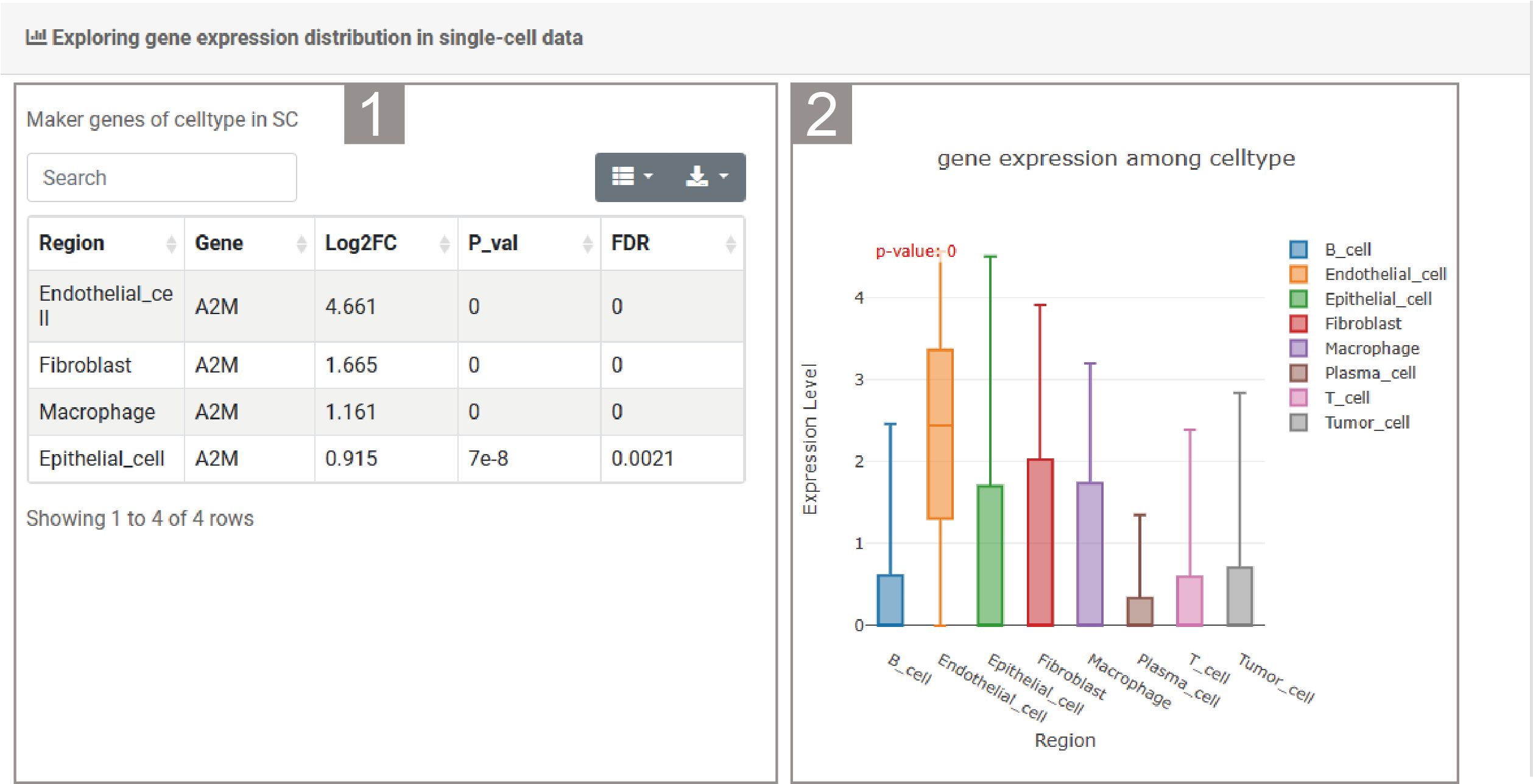
3)Exploring gene expression distribution in single-cell data
1.The list presents relevant information about the differentially expressed genes of interest in the corresponding single-cell datasets, including cell type, gene name, Log2FC value, P value and FDR value. Users can search for the cell types they are interested in through the search box.
2.The box plot shows the expression of this gene in different cell types of the corresponding single-cell dataset.
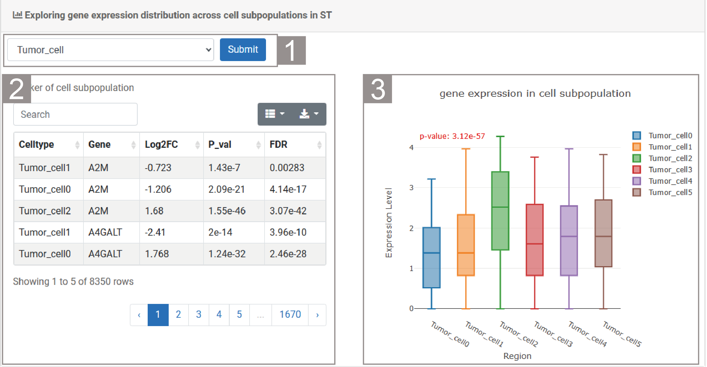
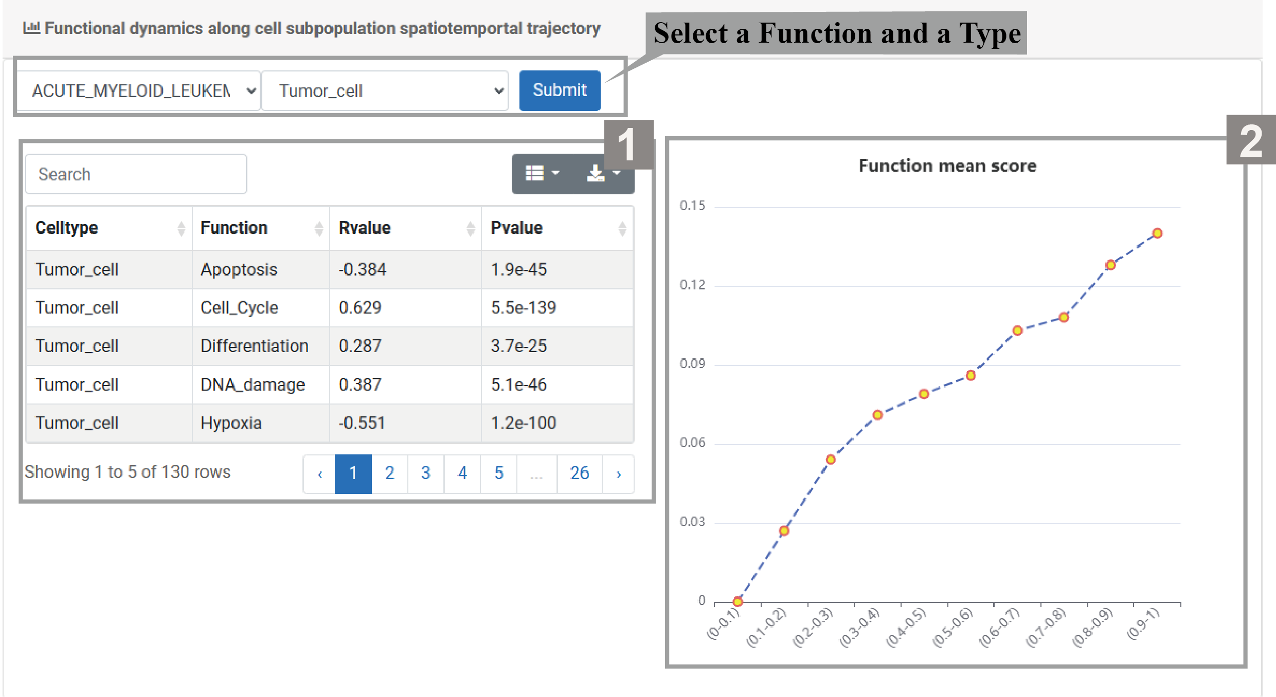
4)Exploring gene expression distribution across cell subpopulations in ST
1.The user can select a cell type and click “Submit”.
2.The list displays relevant information of the cell type, including cell subtype, gene name, Log2FC value, P value and FDR value.Users can search for cell subtypes or genes they are interested in through the search box.
3.The box plot shows the expression of the gene of interest in different cell subtypes of this cell type.
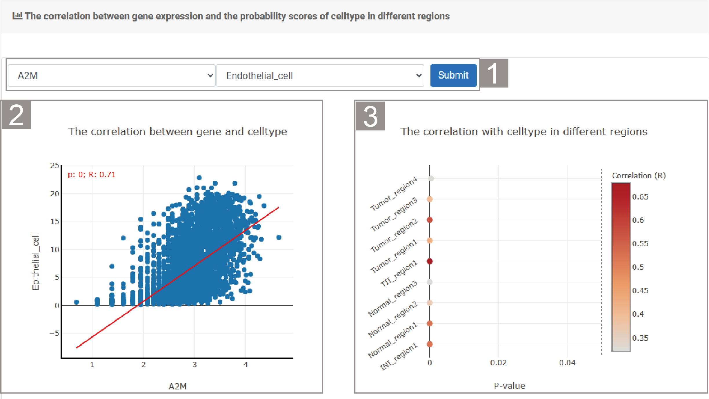
5)The correlation between gene expression and the probability scores of celltype in different regions
1.The user can select a gene and cell type, then click “Submit”.
2.The scatter plot shows the correlation between the genes of interest and the cell types.
3.The bubble chart shows the correlation of the cell types of interest in different spatial regions.
RegionFuntion
RegionFunction reveals the biological functions and gene expressions of region-specific enrichment, as well as the causal interactions between cell subpopulations and functions.
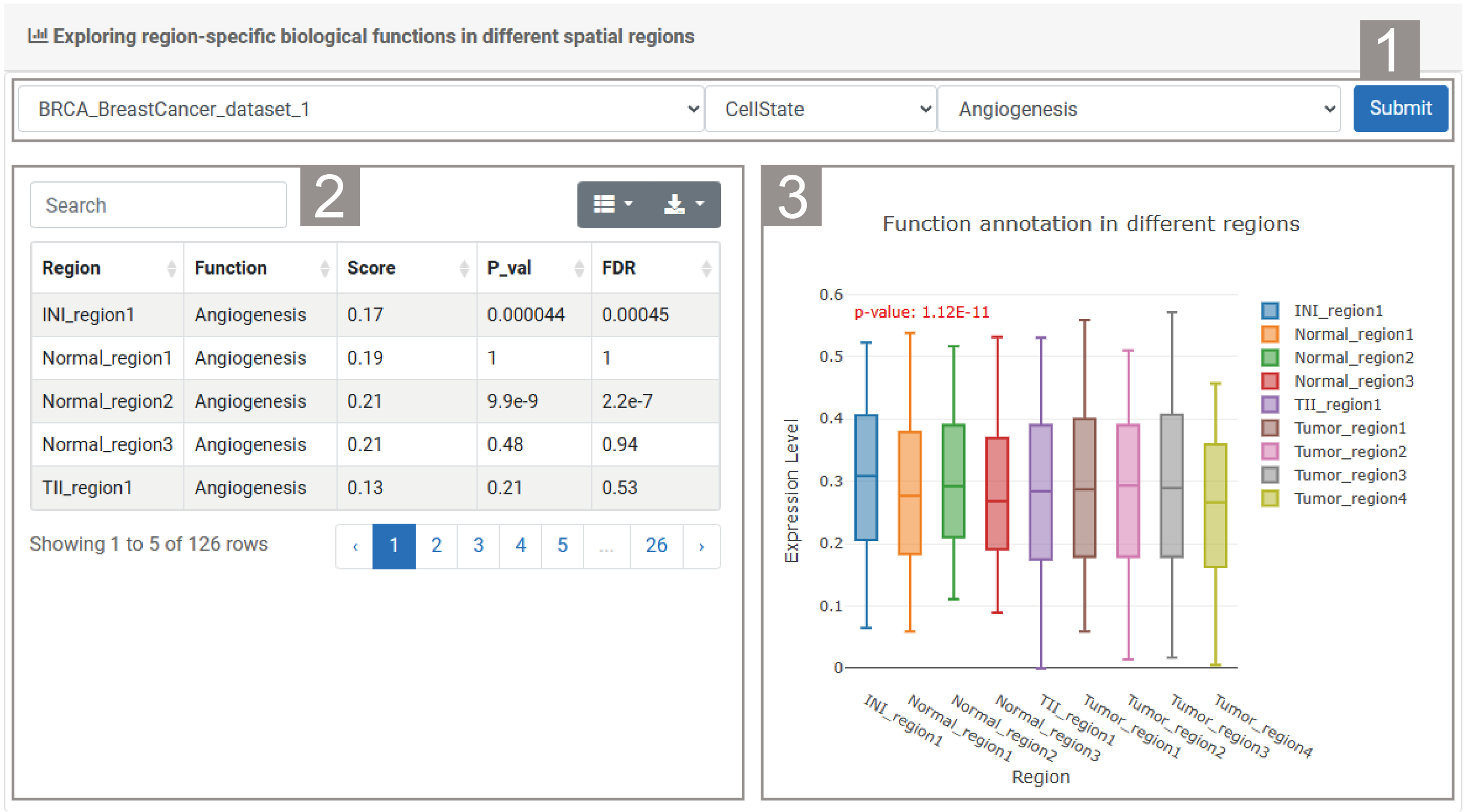
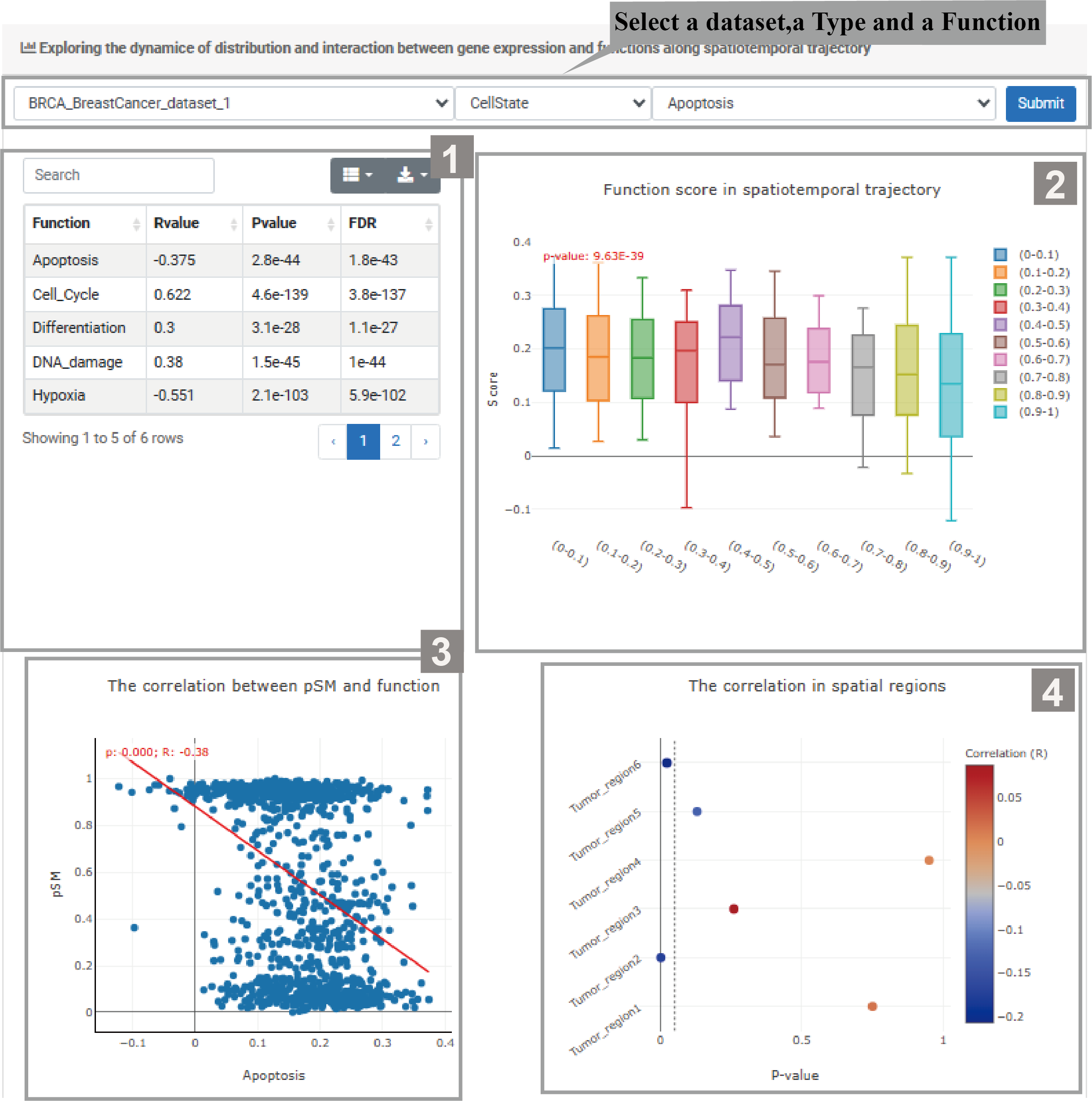
1)Exploring region-specific biological functions in different spatial regions
1.The user needs to select a dataset , enrichment analysis method and biological function, then click “Submit”.
2.The list presents the relevant result information of the enrichment method, including spatial region, function, score, p-value and FDR value. Users can search for spatial regions or functions through the search box to view relevant information.
3.The box plot shows the expression of function in different spatial regions.
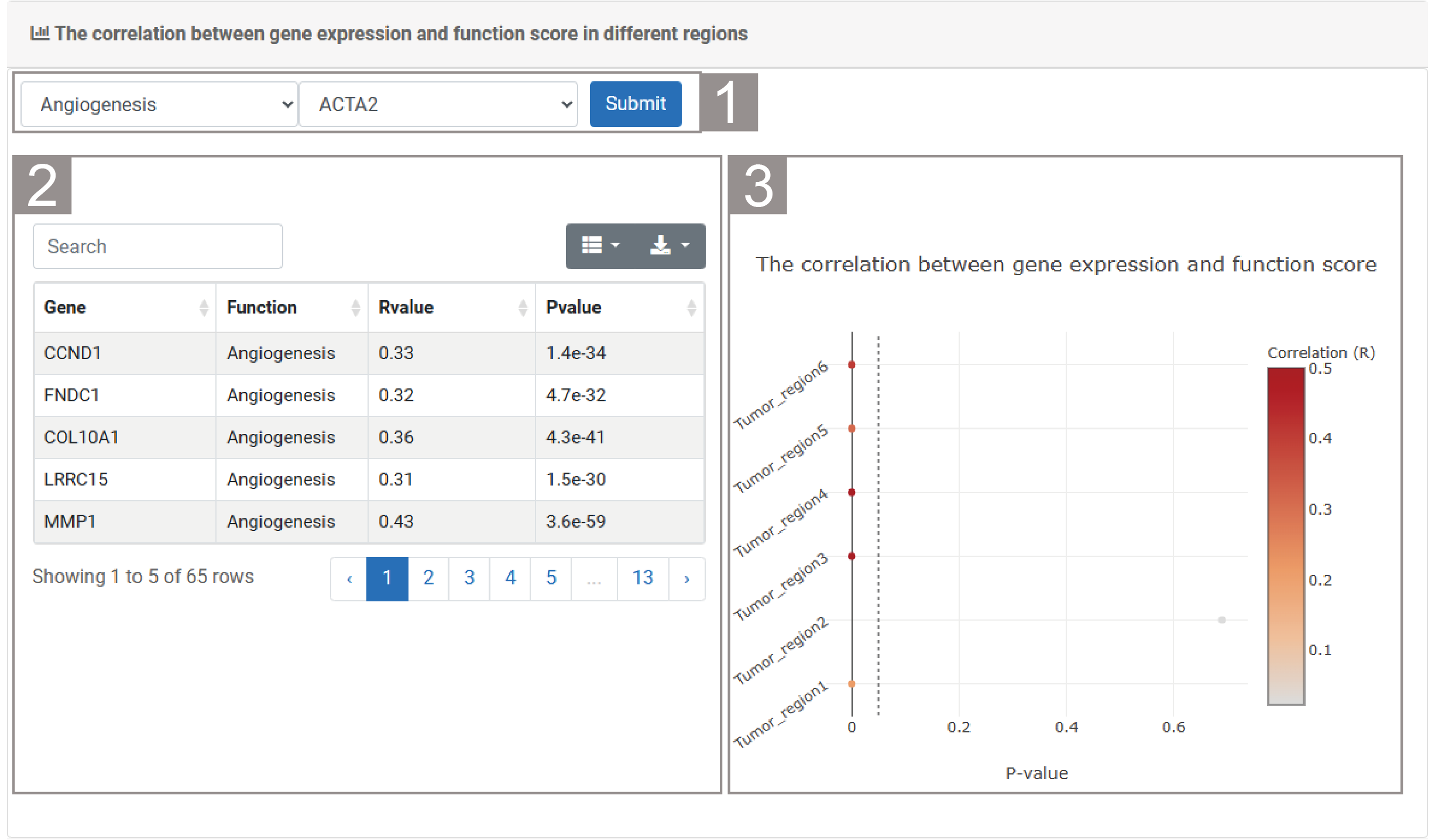
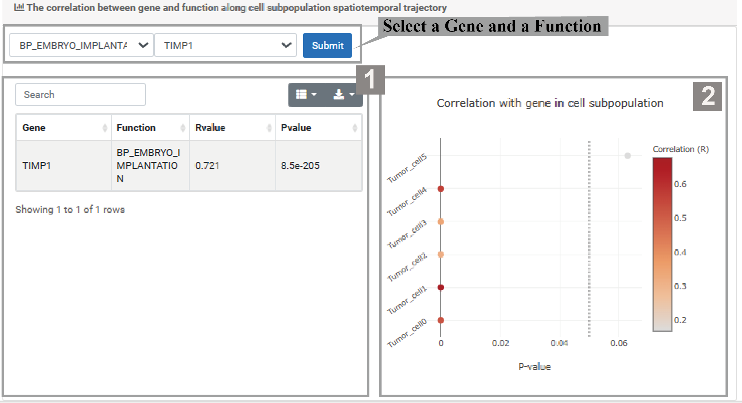
2)The correlation between gene expression and function score in different regions
1.The user needs to select a function and gene, then click “Submit”.
2.The list presents information about the functions and their related genes, including gene names, functions, R values and P values. Users can search for functions or gene-related information through the search box.
3.he bubble chart shows the correlation between the score of the selected function and the expression of the selected gene.
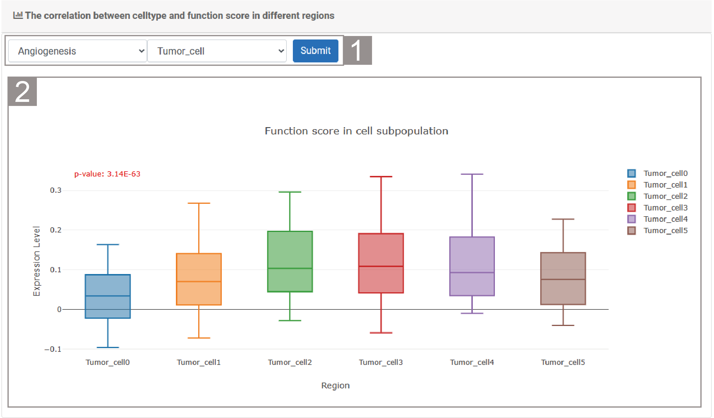
3)The correlation between celltype and function score in different regions
1.The user needs to select a function and cell type, then click “Submit”.
2.The box plot shows the score of the selected function within the cell subtypes of the selected cell type.
RegionLR
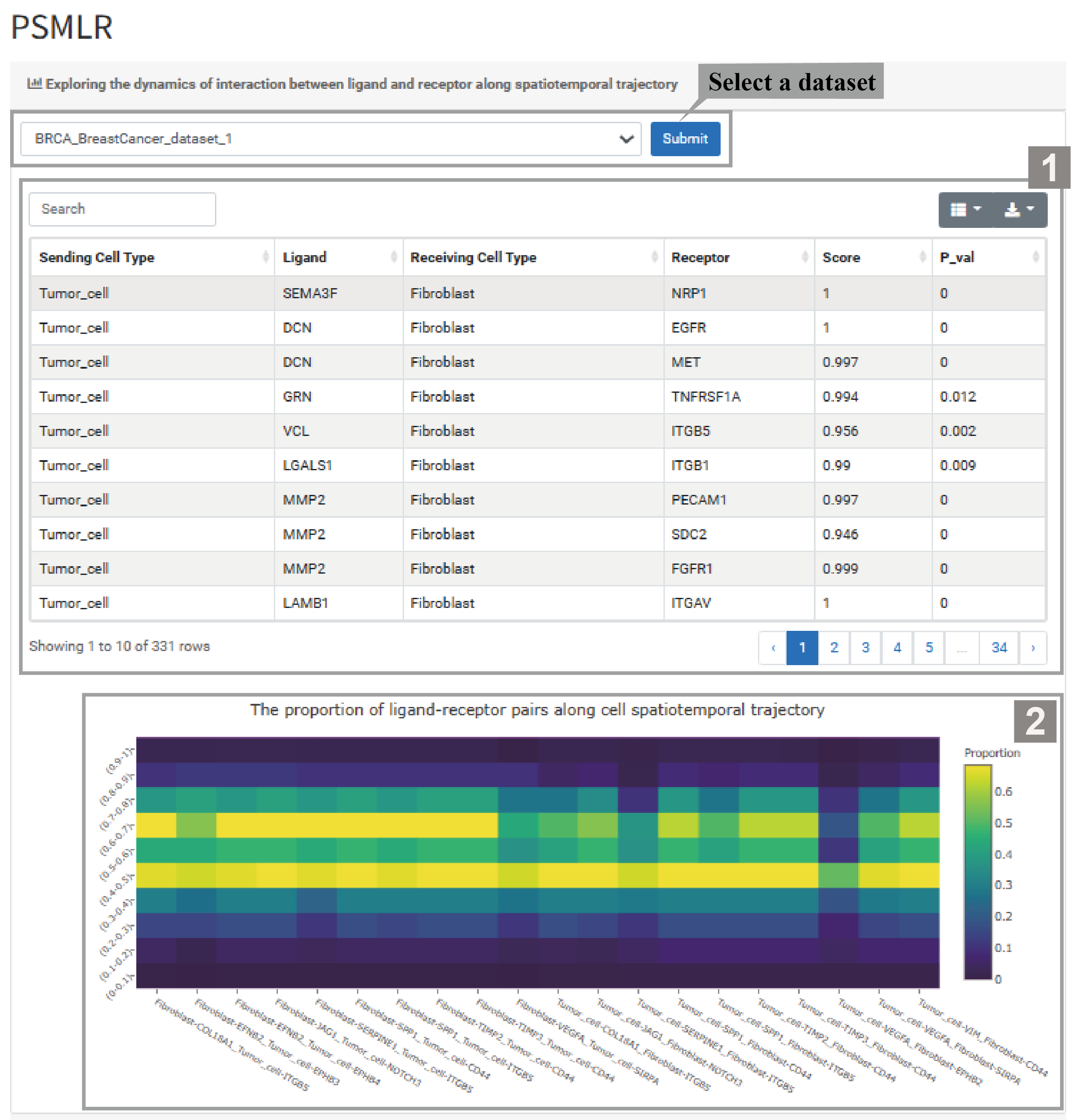
RegionLR characterizes spatial heterogeneity of ligand-receptor pairs across spatial regions.
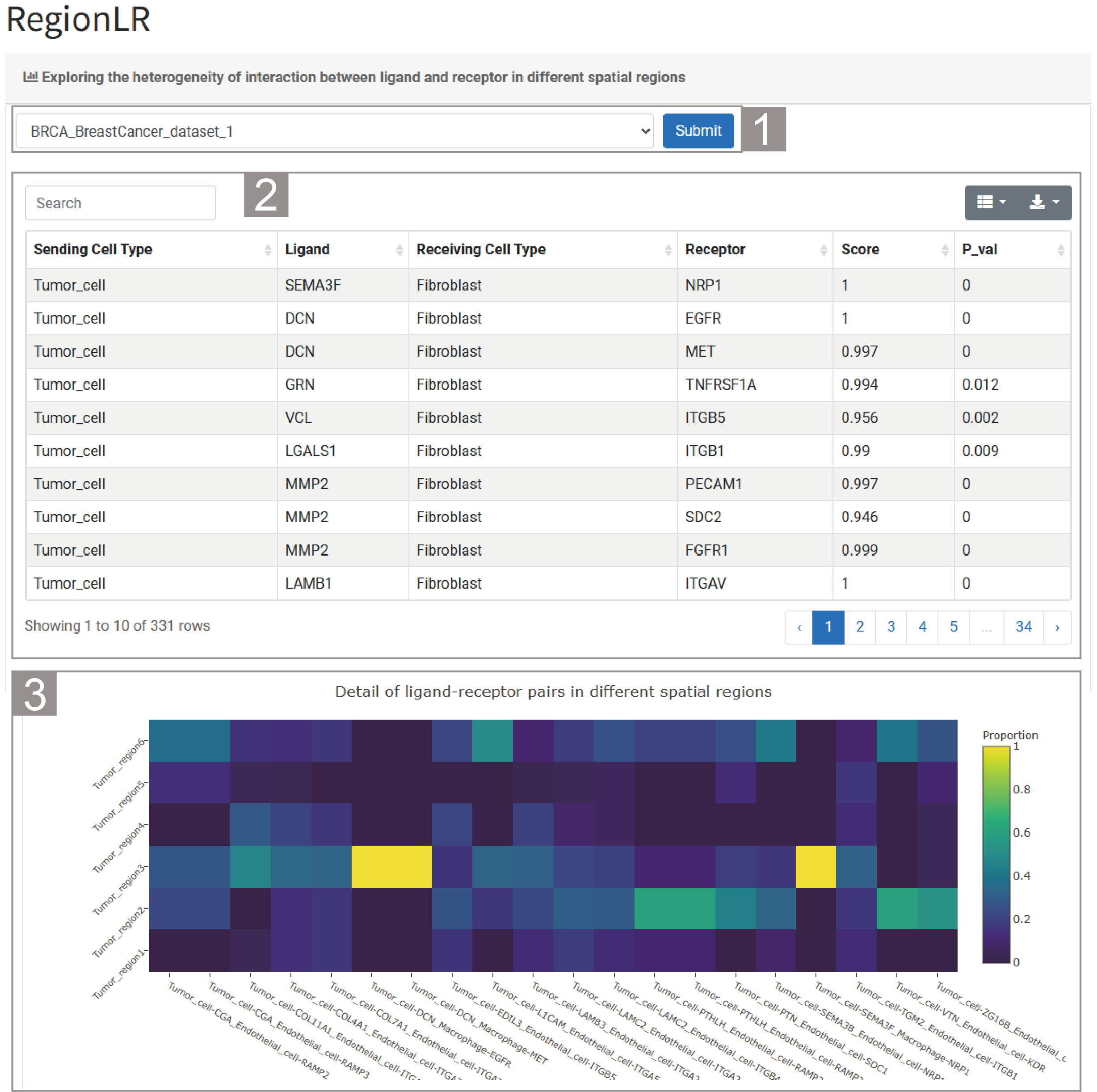
1)Exploring the heterogeneity of interaction between ligand and receptor in different spatial regions
1.The user needs to select a dataset and click “Submit”. By default, the analysis result of the dataset “BRCA_BreastCancer_dataset_1” is given.
2.The list provides the results of intercellular interactions in this dataset. The specific information includes the celltypes involved in the interactions, ligand-receptor pairs, interaction scores and the significance of intercellular interactions.
3.The figure shows the ligand-receptor pairs with the highest interaction ratio in each region.
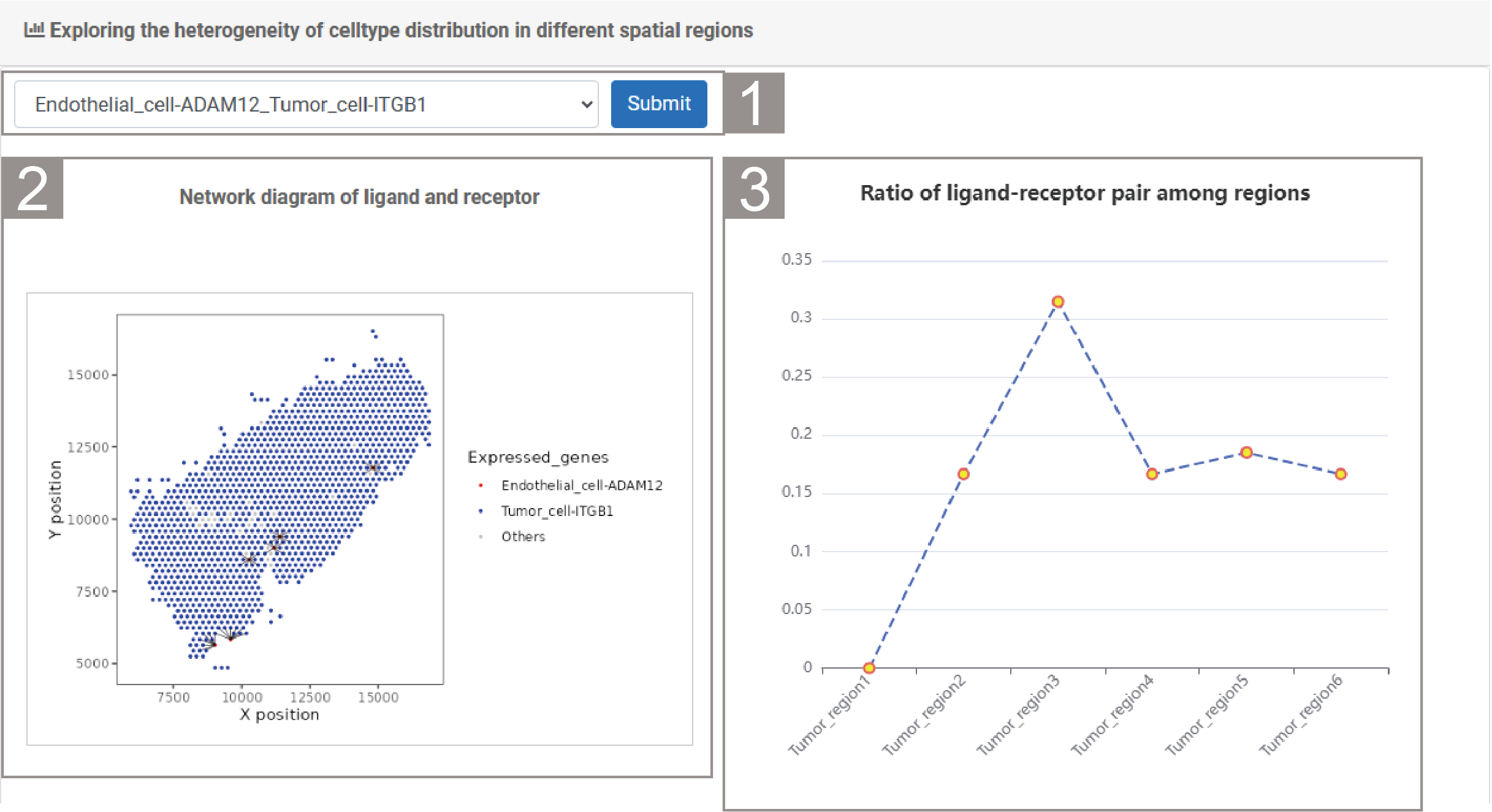
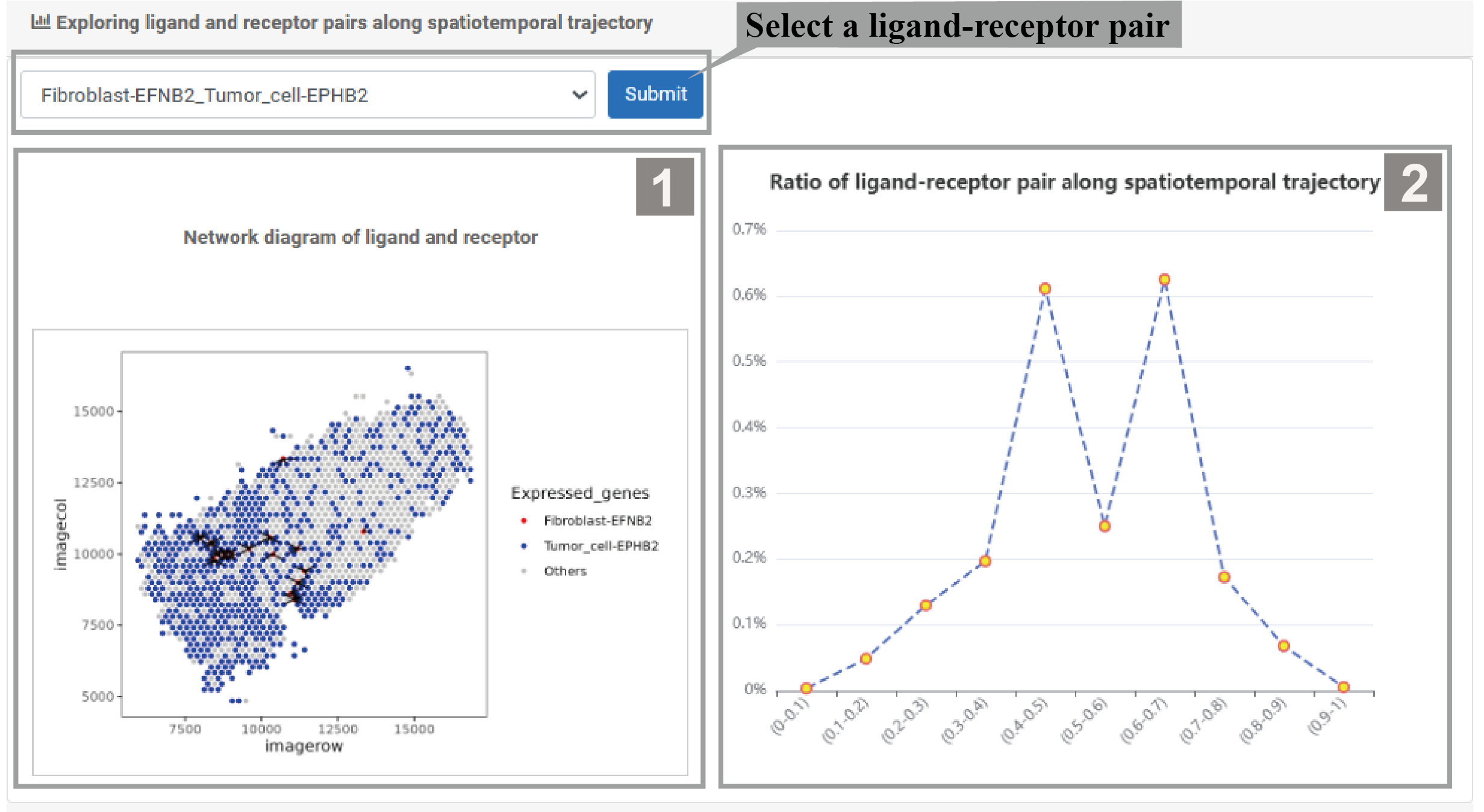
2)Exploring the heterogeneity of celltype distribution in different spatial regions
1.The user needs to select a ligand-receptor pair, then click “Submit”.
2.The spatial transcriptome section revealed the interaction network of this ligand-receptor.
3.The line chart shows the ratio of ligand-receptor pair in different spatial regions.
Spatiotemporal Dynamics Module including four tools.
PSMCell
PSMCell illustrates detailed feature distribution of cell subpopulations along cell spatialtemporal trajectory.
1)Select the dataset of your interest ,unraveling the evolutionary trajectories of cell subpopulations in the spatiotemporal dimension.
1.The basic information provides an overview of the dataset, covering the Dataset Name, Cancer type, Species, Spot Number, Sequencing technique, Region Number, and Celltype Number.
2.The Pseudo-Spatiotemporal Map shows cell distribution in the pseudo-spatiotemporal mapping. A color bar on the right indicates Cell Type Value, with lighter colors meaning higher value.
3.Region Distribution in ST shows the spatial distribution of different areas (cancer and stromal regions), with distinct colors for each type, and allows zooming in/out via mouse clicks.
4.The Spatial region along spatiotemporal trajectory shows the distribution of cell subpopulations along the spatiotemporal trajectory, with different colored dots representing different region types.
2)Select a celltype , analyse Cell subpopulations along spatiotemporal trajectory.
1.The Pseudo_Spatiotemporal Map shows the distribution of this cell type in the pseudo- Spatiotemporal mapping. The color of the dots indicates the Color Type Value, with purple indicating low value and yellow indicating high value.
2.The Cell subpopulation along spatiotemporal trajectory shows their distribution across different spatiotemporal paths. Each color signifies a distinct cell subgroup, and their distribution is shown on the UMAP1 axis.
3.Region Distribution in ST shows their overall distribution across the entire ST, with different colors representing different cell subgroups.
4.Spatial region along spatiotemporal trajectory shows cell subgroup distribution in these regions, with different colors representing different regions.
PSMGene
1)Select a dataset and a TransitionGene, exploring the dynamics of gene expression along spatiotemporal trajectory.
1.The gene information table shows the R value and P value of the selected gene. Users can search for and download the data they need.
2.The box plot shows changes in gene expression levels across different spatial regions. The P value indicates that the differences in gene expression among these regions are statistically significant.
3.The scatter plot shows the relationship between gene expression and PSM. The P value and R value indicate the correlation between them.
4.The bubble plot shows the correlation strength between gene and PSM in different spatial regions, with bubble color and size indicating respectively correlation and significance.
2) Users can select a cell type and a TransitionGene,analyze Gene expression along the cell subpopulation spatiotemporal trajectory.
1.The box plot shows changes in gene expression levels across different spatial regions. The P value indicates that the differences in gene expression among these regions are statistically significant.
2.The line plot shows the mean gene expression across different spatial regions, and the P value represents the significant difference in gene expression.
3.The scatter plot shows the relationship between gene expression and PSM. The P value and R value indicate the correlation between them.
4.The bubble plot shows the correlation strength between gene and PSM in different spatial regions, with bubble color and size indicating respectively correlation and significance.
PSMFunction
1)Select a dataset,a Type and a Function, Exploring the dynamice of distribution and interaction between gene expression and functions along spatiotemporal trajectory.
1.The function information table shows related statistical information of the selected function, including R values and P value. Users can search for or select the data they need to download.
2.The box plot shows changes in function scores across different spatial regions. The P value indicates that the differences in function scores among these regions are statistically significant.
3.The scatter plot shows the correlation between PSM and the selected function. The P value and R value indicate the correlation between them.
4.The bubble plot shows the correlation strength between function and PSM in different spatial regions, with bubble color and size indicating respectively correlation and significance.
2)Select a Function and a Type, explore the functional dynamics along the spatiotemporal trajectory of cell subpopulations.
1.The function information table shows related statistical information of different cell types and functions, including R value and P value. Users can search for or select the data they need to download.
2.The line chart shows the mean function score across different spatial regions and the trend of function score changes with the spatial regions.
3)Select a Gene and a Function, explore the correlation between them in the spatiotemporal trajectory of cell subpopulations.
1.The gene-function table shows the related statistical information of different genes and functions, including R value and P value. Users can search for or select the data they need to download.
2.The bubble plot shows the correlation intensity between genes and functions in different cell subpopulations, with bubble color and size indicating respectively correlation and significance.
PSMLR
1)Select a dataset, explore the dynamic interactions between ligands and receptors in cell subpopulation spatiotemporal trajectories.
1.The ligand-receptor table shows details like Sending/Receiving Cell Types, Ligand, Receptor, Score,and P_value. Users can download the data from the top-right corner.
2.The heatmap shows the proportion of different ligand-receptor pairs along the spatiotemporal trajectory of cell subpopulations. The color indicates the P-value, with colors closer to yellow signifying higher significance.
2) Users can select specific ligand-receptor pairs to explore their distribution and interaction in different spatial regions.
1.The network diagram shows the interactions between ligands and receptors.
2.The line plot shows the proportion changes of the ligand-receptor pair across different spatial regions.
To download data in the EvoNiche, select the menu “Download”.